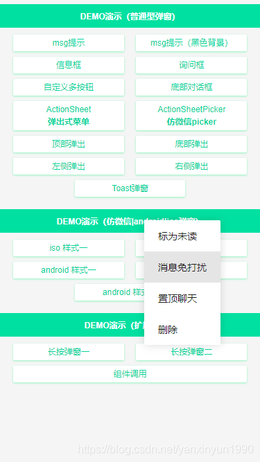
今天給大家分享VPopup 基于Vue.js構(gòu)建的輕量級移動端彈出框組件,詳情如下所示:
一款融合了Vant、NutUI等熱門Vue組件庫中的Popup彈層、Dialog對話框、Toast提示框、ActionSheet動作面板框、Notify通知框等功能。愛掏網(wǎng) - it200.com

快速使用
在main.js中引入組件
// 引入彈窗Popup
import Popup from './components/popup'
Vue.use(Popup)
支持如下兩種 組件式 及 函數(shù)式 調(diào)用插件。愛掏網(wǎng) - it200.com
組件式
...
函數(shù)式
在實際項目開發(fā)中,大家可根據(jù)需要自行選擇調(diào)用。愛掏網(wǎng) - it200.com

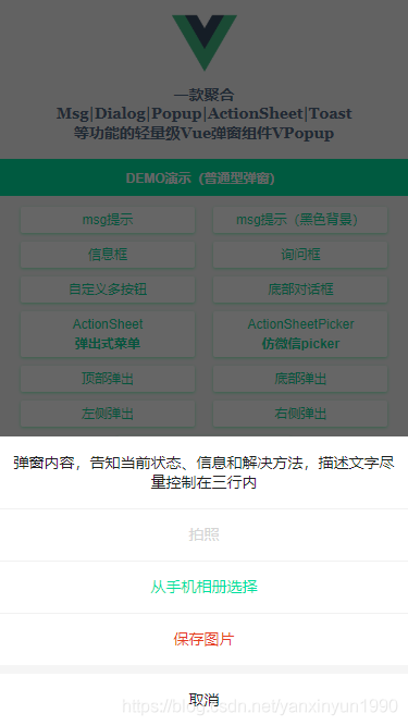
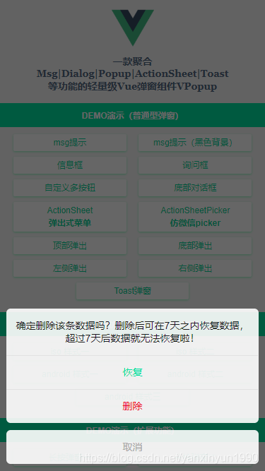
msg信息提示


ActionSheet動作面板框

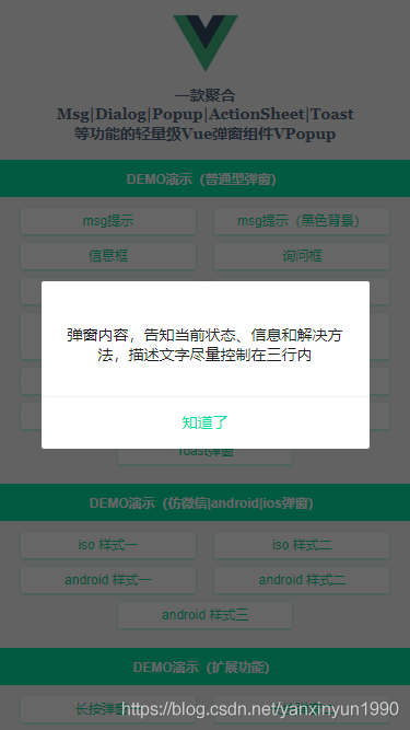
IOS風格彈窗

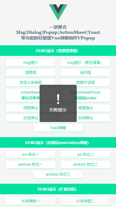
Toast加載提示框

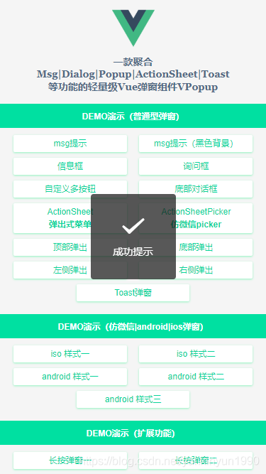
emmm~~ 看了如上效果,是不是覺得還不錯喲!那就繼續(xù)往下看實現(xiàn)過程吧😀
彈窗參數(shù)配置
彈窗支持如下參數(shù)配置,大家根據(jù)需要自行組合搭配使用。愛掏網(wǎng) - it200.com
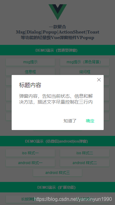
@@Props
------------------------------------------
v-model 當前組件是否顯示
title 標題
content 內(nèi)容(支持自定義插槽內(nèi)容)
type 彈窗類型(toast | footer | actionsheet | actionsheetPicker | android/ios)
popupStyle 自定義彈窗樣式
icon toast圖標(loading | success | fail)
shade 是否顯示遮罩層
shadeClose 是否點擊遮罩時關(guān)閉彈窗
opacity 遮罩層透明度
round 是否顯示圓角
xclose 是否顯示關(guān)閉圖標
xposition 關(guān)閉圖標位置(left | right | top | bottom)
xcolor 關(guān)閉圖標顏色
anim 彈窗動畫(scaleIn | fadeIn | footer | fadeInUp | fadeInDown)
position 彈出位置(top | right | bottom | left)
follow 長按/右鍵彈窗(坐標點)
time 彈窗自動關(guān)閉秒數(shù)(1、2、3)
zIndex 彈窗層疊(默認8080)
btns 彈窗按鈕(參數(shù):text|style|disabled|click)

@@$emit
------------------------------------------
open 打開彈出層時觸發(fā)(@open="xxx")
close 關(guān)閉彈出層時觸發(fā)(@close="xxx")

@@Event
------------------------------------------
onOpen 打開彈窗回調(diào)
onClose 關(guān)閉彈窗回調(diào)
彈窗template模板
/**
 * @Desc VueJs自定義彈窗組件VPopup
 * @Time andy by 2024-10-06
 * @About Q:282310962 wx:xy190310
 */
通過監(jiān)聽組件傳過來的v-model值調(diào)用open和close方法。愛掏網(wǎng) - it200.com
watch: {
	value(val) {
		const type = val ? 'open' : 'close';
		this[type]();
	},
},

另外還支持右鍵彈窗/長按彈窗及自定義插槽內(nèi)容。愛掏網(wǎng) - it200.com

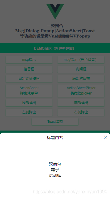
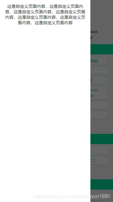
當 content 和 自定義插槽 內(nèi)容同時存在,只顯示插槽內(nèi)容!!! 
如果想通過函數(shù)式調(diào)用組件,需要用到Vue.extend擴展構(gòu)造器來實現(xiàn)。愛掏網(wǎng) - it200.com
import Vue from 'vue';
import VuePopup from './popup.vue';

let PopupCOnstructor= Vue.extend(VuePopup);

let $instance;

let VPopup = function(optiOns= {}) {
 // 同一個頁面中,id相同的Popup的DOM只會存在一個
 options.id = options.id || 'nuxt-popup-id';
 $instance = new PopupConstructor({
 propsData: options
 });
 $instance.vm = $instance.$mount();

 let popupDom = document.querySelector('#' + options.id);
 if(options.id && popupDom) {
 popupDom.parentNode.replaceChild($instance.$el, popupDom);
 } else {
 document.body.appendChild($instance.$el);
 }

 Vue.nextTick(() => {
 $instance.value = true;
 })

 return $instance;
}

VPopup.install = () => {
 Vue.prototype['$vpopup'] = VPopup;
 Vue.component('v-popup', VuePopup);
}

export default VPopup;
這樣就實現(xiàn)了在Vue原型 prototype 上掛載 $vpopup 方法及注冊 v-popup 組件。愛掏網(wǎng) - it200.com
設(shè)置圓角及關(guān)閉按鈕
設(shè)置round、xclose即可,另外可以配置xposition來設(shè)置關(guān)閉按鈕位置。愛掏網(wǎng) - it200.com
設(shè)置按鈕禁用狀態(tài)
設(shè)置disabled: true 可禁用按鈕事件。愛掏網(wǎng) - it200.com

Okay,基于Vue.js+Nuxt開發(fā)自定義彈出層組件就介紹到這里。愛掏網(wǎng) - it200.com目前VPopup正在Nuxt新項目中使用,屆時也會分享出來。愛掏網(wǎng) - it200.com
最后附上最近兩個實例項目
基于vue+uniapp直播項目實現(xiàn)uni-app仿抖音/陌陌直播室功能
react native 仿微信聊天室實例代碼
到此這篇關(guān)于基于Vue.js+Nuxt開發(fā)自定義彈出層組件的文章就介紹到這了,更多相關(guān)Vue+Nuxt自定義彈窗內(nèi)容請搜索以前的文章或繼續(xù)瀏覽下面的相關(guān)文章希望大家以后多多支持!